interactive prototypes
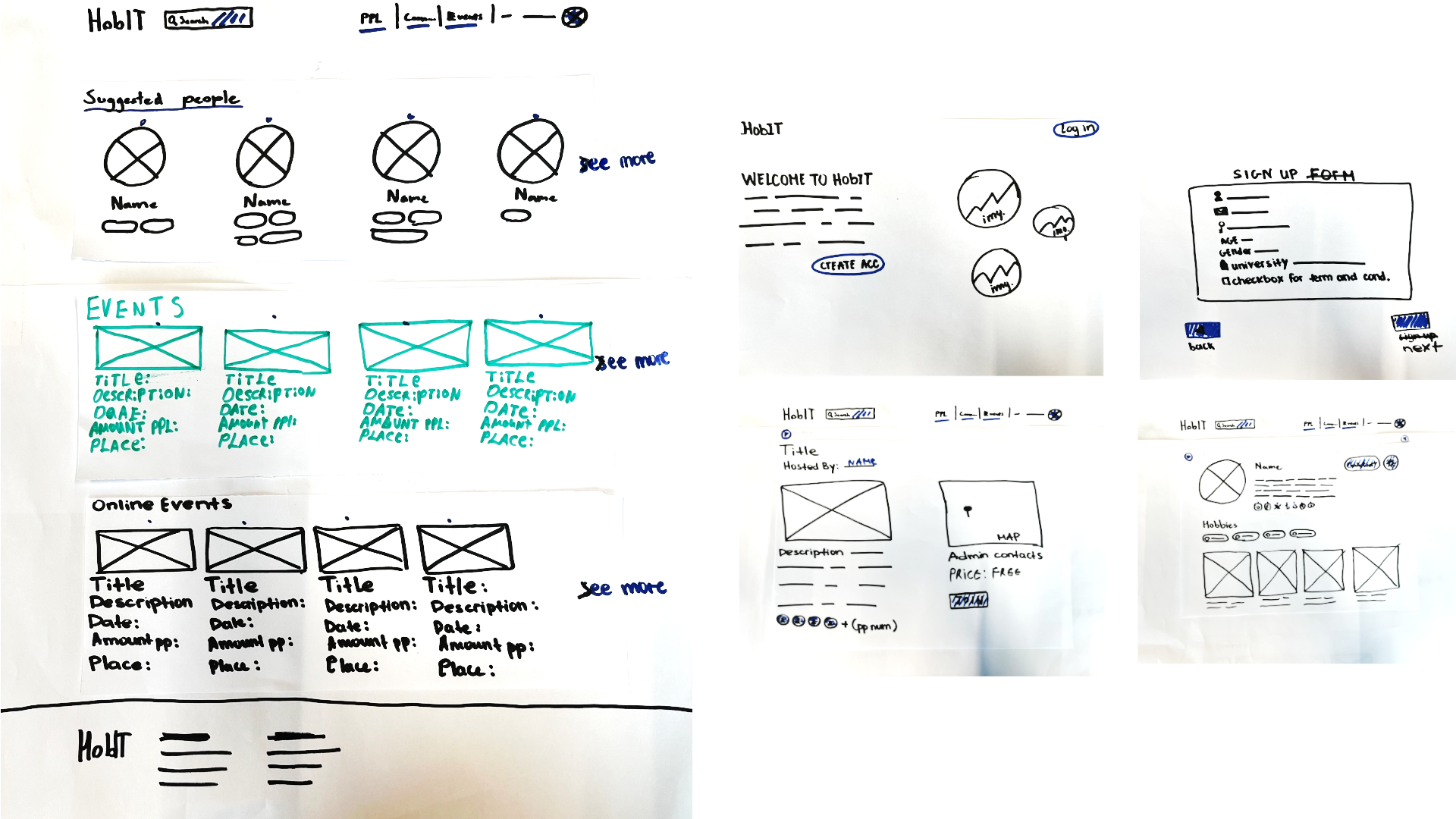
HobIT paper prototype
implementation
For the HobIT project an interactive paper prototype was made to test the site's layout before moving onto a digital prototype on Figma, as well as making sure the site
flowed well.
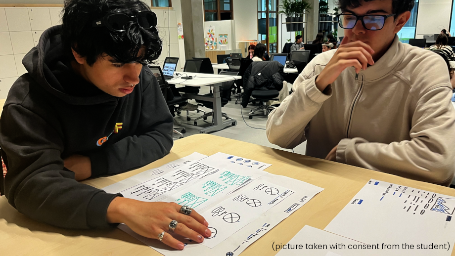
The prototype was tested with two teachers, as well as two semester 2 media students. Testing students was important as they are the target audience of the site, and
getting feedback from semester 2 students specifically could produce feedback from a more experienced perspective.
reflection
When the prototype was first created, not much thought was put into the actual flow of the site. The prototype started on the main page, which skips the entire sign up process where the user actually picks their hobbies. While the sign up was a planned feature, no sign up was actually included in the prototype, leaving out important context as to how the site works.
After receiving this feedback from a teacher, a sign up page was added so future testers could understand the site better. The teacher also mentioned the lack of clarity on which buttons were actually "clickable". This was addressed by making the interactive buttons a different color to help them stand out.
Lastly, while not directly brought up as feedback, I noticed one tester would frequently ask "What is this?" to certain buttons and elements, as they contained text that was hard to make out. Most of these cases were a result of the text being quite small and written in marker. After this observation I'd like to ensure that text in future paper prototypes is more legible to avoid confusion.
HobIT digital prototype

implementation
A digital Figma prototype was also made for the HobIT project. This prototype was designed as a mid to high fidelity prototype to test colors and layouts. Interactive button navigations were added to present the site and its flow to the class and teachers, from which feedback was gathered.
reflection
The presentation of this prototype went quite well and any feedback gathered was design based. I'm satisfied with how it turned out and feel more confident in making and presenting digital prototypes in the future.
Space-E paper prototype
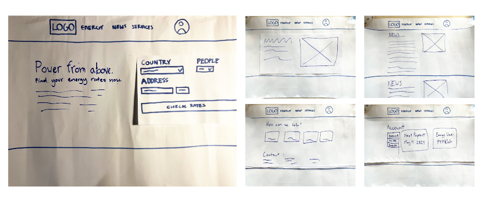
implementation
This paper prototype was made during the orienting phase for the Space-E energy site. It was created rather quickly, with the main goal being to test layouts.
reflection
As this prototype was made in the orienting phase, it lacks things that I'd learn later on (interactive buttons aren't colored differently, for example). However, the site's flow makes sense as it's not a very complicated site to begin with. For a prototype made during the orienting phase I'd say it was sufficient for what was needed at the time.