iterative process
portfolio design
My portfolio has gone through multiple changes based on feedback I received from others.

initial design
The initial design I showed was very flat and minimal. I tried to subtly incorporate hints of 2000s aesthetics while keeping the site safe and generally modern looking. The font and use of drop shadows on text, alongside the Nintendo Wii-inspired rings in the background were added to nudge the site in that aesthetic direction.
feedback
Upon asking for feedback from one of my teachers, they noted that the text drop shadows looked very dated, and didn't realize it was intentional until I told them.
While they found the design to be good in general, they suggested I go all out with the aesthetic instead of holding back. Doing so would communicate the aesthetic intent better, as well
as allow me to be more creative with it as there was much potential in the idea.
first iteration
To further realize the aesthetic, I decided to first tackle the background, which was originally quite plain.
After looking to Microsoft and Nintendo designs at the time for inspiration and messing around in GIMP, I came out with these grey bubble-like shapes. I applied a blur to the previously flat rings, with the one on the right being blurrier to somewhat imply depth.
I also made a version of the site with darker colors to get feedback on which one looked better.
validation and feedback
The background change was received quite well by my teacher, as it helped further push the aesthetic's presence on the site. It was brought up however that as a result of the background color change, the contrast between it and the orange navigation text suffered. This was much more apparent on the alternate version of the site, as the background was much darker.

We then noticed that one of the designs I had on my mood board made use of white text on orange buttons, instead of just making the text orange. My teacher suggested I try working with something like that instead, as I could maintain the color scheme of the site regardless of the background.
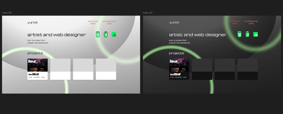
second iteration
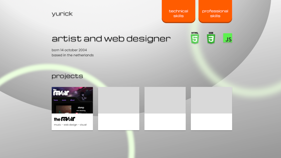
When working on the buttons I initially struggled in getting something I was happy with. I started out with a flat orange panel with a shaded bottom, trying out some kind of skeuomorphism by making the button look 3D. I realized the flat color of the buttons clashed with the gradients of the background, and so I started experimenting with gradients on the buttons themselves.

I first went with a metallic sort of look, later trying a more simple shading with gradients. I ended up going for the latter after getting feedback from a friend, as well as noticing the shading reinforces a 3D shape to the button, as opposed to the metallic one where it still looks like the original flat design.
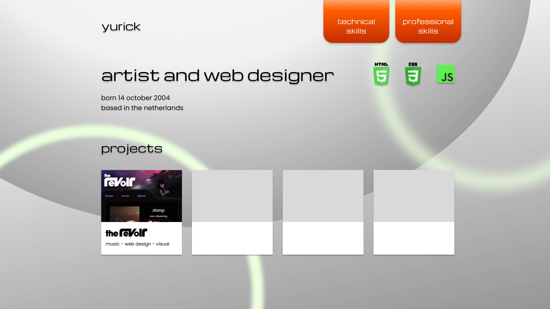
While I felt happy with the buttons, they shifted the site away from what I originally had in mind, pulling it towards a more gradient based design. I temporarily scrapped the "projects" view as they no longer fit the site visually, and doing so also helped me shift focus towards the learning outcomes.

I ended up taking inspiration from the old Adobe Flash download site and changed the navigation background from transparent to a grey gradient. With this shift from transparency, I applied the same gradient look to the rest of the page.
feedback
This final version of the site's design was received well by my teachers, and I myself was very satisfied with the design and its progression through the various iterations made.
HobIT design
initial design
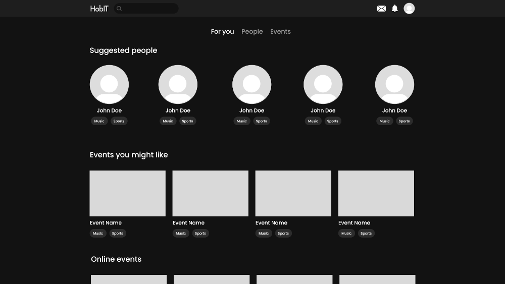
I was responsible for the main page and navigation bar design for HobIT. While the site looked clean, our team received feedback suggesting more color on the site to help it pop, as well as choosing a color outside the typical red yellow blue you see on most social media sites.
It was also suggested that we better communicate the site's premise of hobbies and interests. The recommendations are simply labeled as "Suggested people" and "Events you might like", when the hobbies should be the forefront of the recommendation.
first iteration
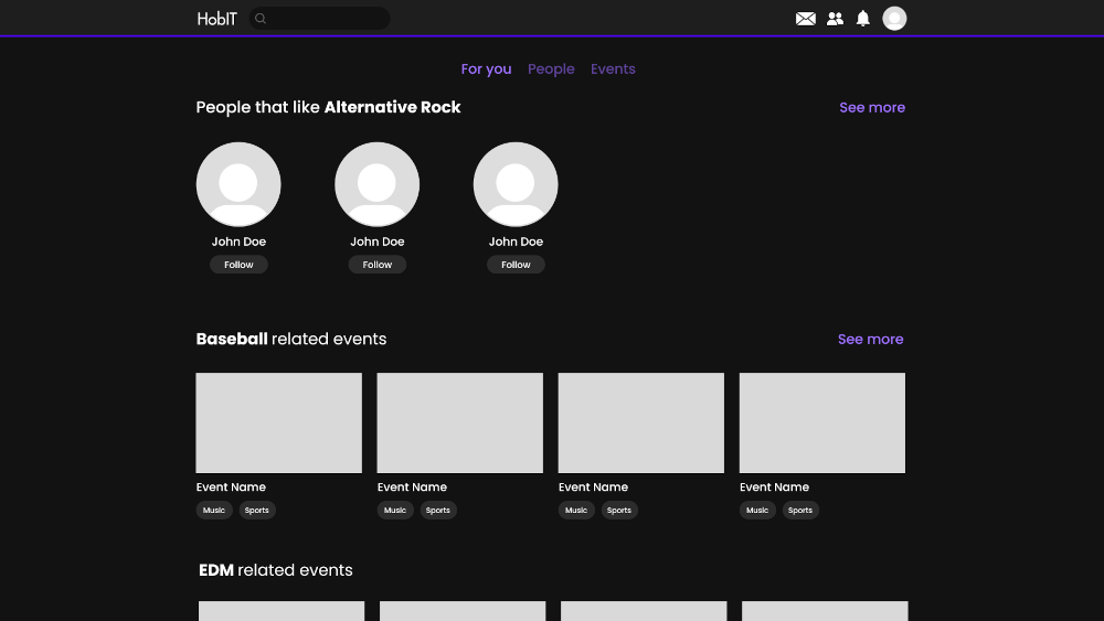
To give the site more color, a neon purple theme was chosen and can be seen in the border under the navigation bar, as well as the recommendation tabs and "See more" buttons. The suggestion headings were renamed to be more catered towards certain hobby/interest tags, suggesting people or events based on a specific hobby.
A "Follow" button was added to replace the tags under the suggested users, as competitor analysis revealed this to be a common design choice.
final iteration
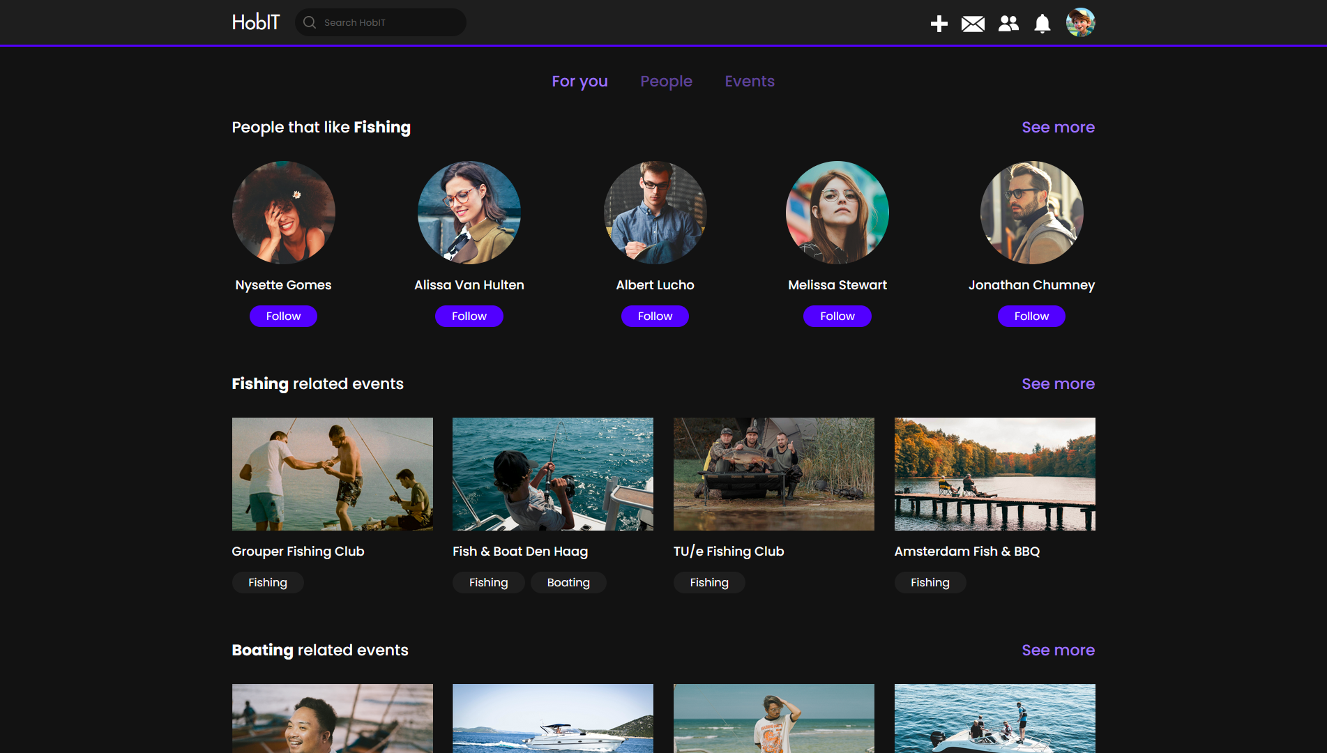
Although the first iteration is very close to the final version, there were still some minor changes made based on more feedback.
The ability to create an event was previously tucked into the profile page, which make it unnecessarily complicated to navigate to. We fixed this by adding a "+" button to the
navigation bar, allowing the user to create an event from any page.
It was also suggested we make the "Follow" button change when clicked on. We made the default color of the button match the purple them, turning grey and changing to "Following"
when clicked on.
Space-E design
The Space-E site also went through some minor changes based on feedback.
initial design

The site's Figma prototype is quite similar to the final version. I looked to some other energy sites to get an idea of what one would expect on such sites, and made a basic modern looking site.
feedback
The design was well received by my teacher, though a few suggestions were made. Firstly, I had a navigation button for "Services" where the user could get help or support, but the word "Services" is a little too ambiguous for this page, and could be renamed. Second, there could be a visual representation of the "Hexashade" solar panel that the company's energy comes from.
iteration

I ended up changing "Services" to "Contact", which better describes the purpose of the page. The word "Services" was then reused to replace "Energy", as the company provides more than just energy for people, such as UV ray protection.
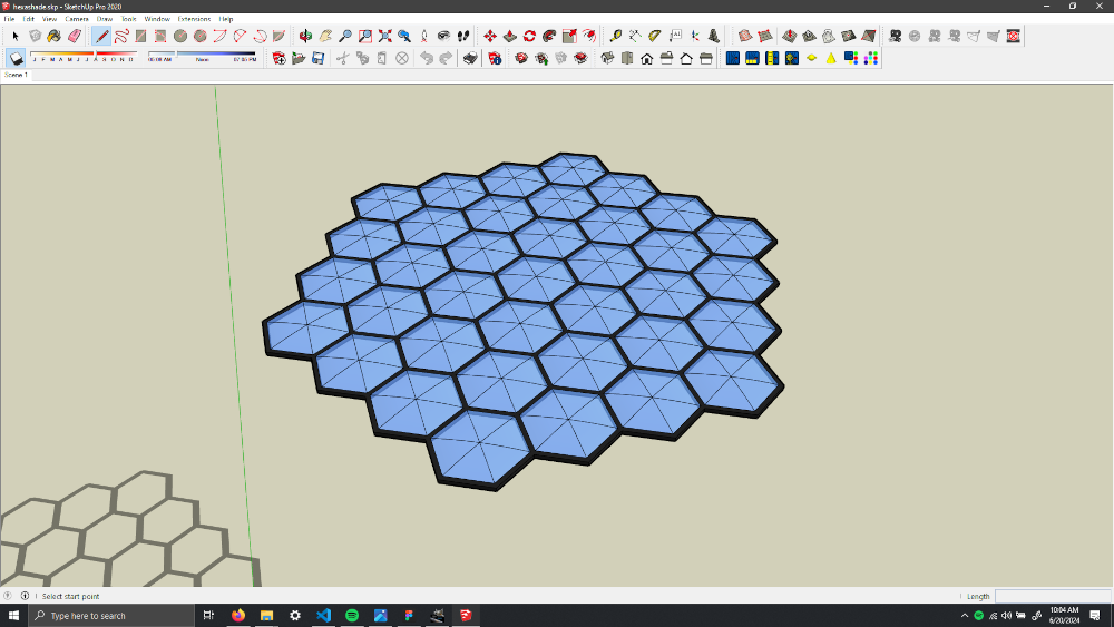
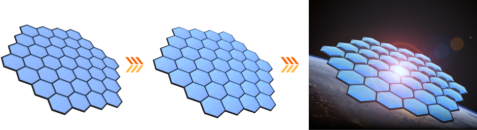
As for the Hexashade itself, I made a 3D model of it in SketchUp that I then rendered and composited onto the Earth background image.
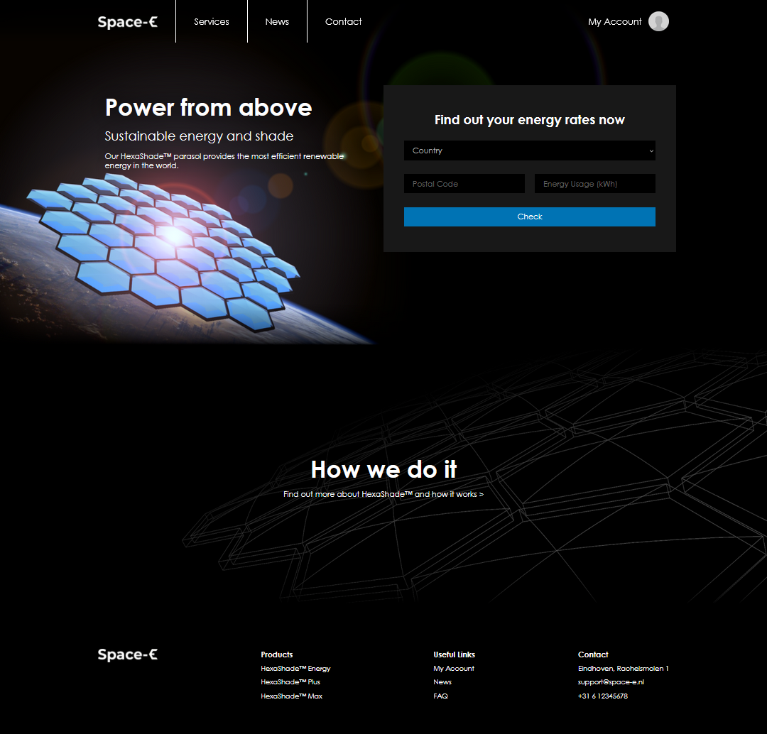
Lastly, I used a wireframe view of the Hexashade as the background of the "How we do it" section of the page, indicative of the panel's creation process.