trends and developments
artificial intelligence
implementation
Artificial Intelligence has had a recent surge in relevance thanks to ChatGPT and other such models. During the course of this semester I've made occasional use of ChatGPT to help understand any syntax or troubleshoot my code, as well as check my text for any spelling/grammatical suggestions or errors.
reflection
Using ChatGPT has proven to be very helpful, but it's not perfect. It's sometimes very wrong in what it outputs, but it explains
well and comes in handy when I have a specific issue that I can't otherwise find on Stack Overflow or other such sites.
Despite my slight paranoia about the future regarding Artificial Intelligence, I think it has many benefits that improve workflow and learning.
2000s aesthetic portfolio
inspiration
The 2000s have become a source of nostalgia for Gen Z (me included), and its aesthetics are making a resurgence in the form of fashion, music and design. Despite some aspects of it being quite dated, I decided to take inspiration from various 2000s media and make use of the aesthetics in my portfolio.
implementation
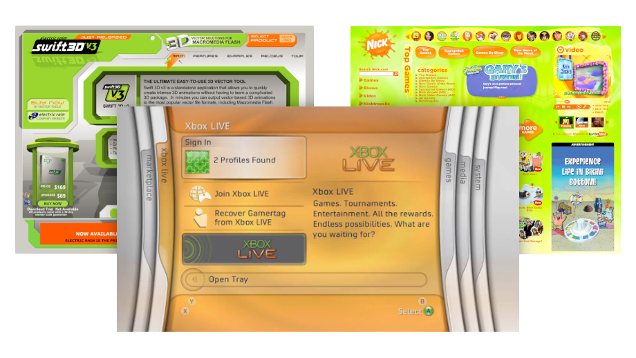
I gathered images of various sites I used as a kid alongside other sites from the era that evoke the same feeling, which I found through Web Design Museum. I also looked at user interfaces from the time, particularly those used in video game consoles and PC operating systems.

I went for an orange and green color scheme, taking inspiration from 2007 Nickelodeon and the original Xbox 360 dashboard, as well as a product page for Swift3D.

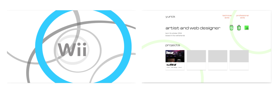
This early iteration of the site takes inspiration from the rings seen in early Nintendo Wii commercials.

The portfolio background once again takes inspiration from the Xbox 360, as well as commercials for the Nintendo DS which featured a soft gradient background. The Nintendo Wii rings from the early designs were also softened with a blur to reflect the change.

On the topic of gradients, I took inspiration from the Adobe Flash download site which I frequently saw as a kid. Gradients like these are quite ugly, but were used quite often at the time and really add to the aesthetic.

Lastly, I've made use of a bit of skeuomorphism on the navigation buttons. Alongside the shading, the shadow casted by them blurs less and gets slightly darker when hovered on, emulating how a shadow would work in real life.
reflection
I'm very satisfied with how the site turned out. I feel the aesthetic gives the site some character and helps it stand out. It also makes me more confident in trying riskier design ideas, and I look forward to doing so in future projects.
adobe color

implementation
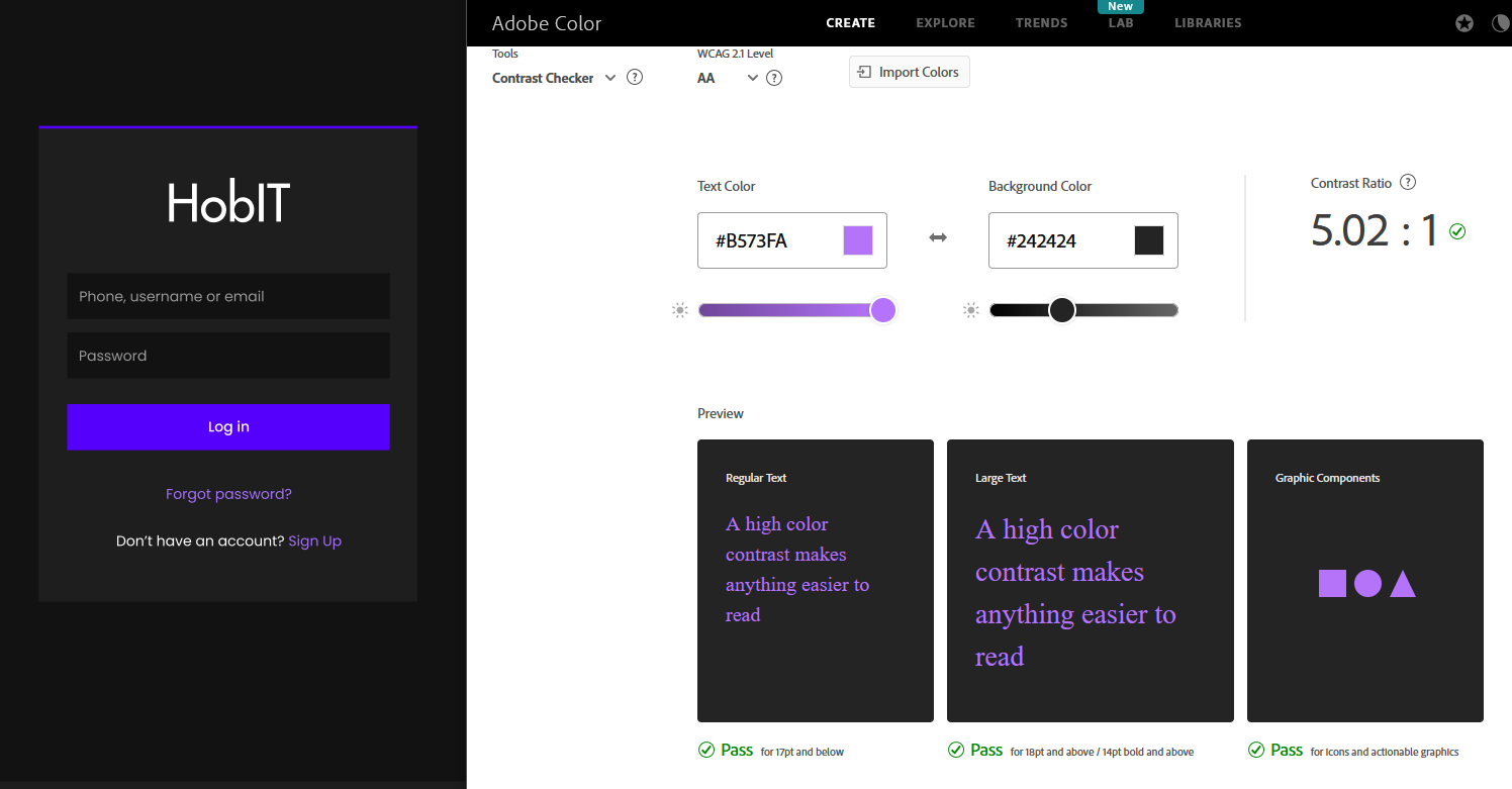
I've made use of Adobe Color to ensure the color schemes of my designs were visually appealing, as well as checking its contrast and readability
by making use of its accessibility tools.
Keeping accessibility in mind helps my designs be more legible and usable by as many people as possible.