PROJECT CENTER
Browser extension made to help individuals with ADHD more easily browse the web.
CONTEXT
CONCEPT
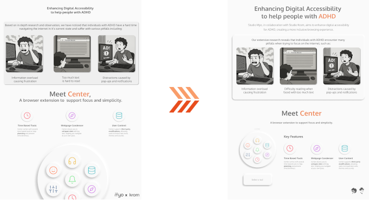
With my team Studio Myo having innovation as a core value, we chose to work with Studio Krom as a client for this semester's project. The goal with this project was to help digital accessibility, and we chose individuals with ADHD or focus issues as our target audience due to their relevance in this generation. With so many apps, ads and services fighting for your attention, it's harder than ever to stay focused.
CLIENT
We scheduled regular bi-weekly meetings with our client every to dicuss our progress and plans, as well as gathering feedback and suggestions.

RESEARCH QUESTIONS
We began researching the topic, starting with the following questions:
- Main Question: How might we improve focus on performing tasks for individuals with ADHD?
- Sub Question 1: What pitfalls do individuals with ADHD face when performing tasks and why do they experience them?
- Sub Question 2: How can our digital interface be designed and optimized to help mitigate these pitfalls?
- Sub Question 3: How effective are digital tools (e.g. focus apps, timers, task managers, sounds) in helping individuals with ADHD manage their tasks?
- Sub Question 4: What are the barriers individuals with ADHD face when adopting these tools?
LIBRARY RESEARCH
I became very interested in the idea of Time Blindness after coming across a video by HealthyGamerGG, a psychologist and licensed therapist who makes videos aimed primarily at Gen Z and their increasing use of social media, video games and the internet as a whole.
And so I made use of Library Research to analyze the video, alongside articles from the sources he referenced to make a short analysis on time blindness, which helped me come to the following conclusions:
- Biological clock in an ADHD brain is impaired, which is needed to estimate task duration
- As a result, estimates are incorrect and the individual will make poor decisions based on them
- Alternative means of teaching the ADHD brain is needed, particularly making use of sensory input with things such as an alarm or timer
- ADHD Brain learns effectively from sensory input, can then produce and make use of accurate time estimates as intended
Based on this research, we decided to create a multi-tool browser extension that would help minimize distractions and keep the user focused on their tasks.
I proposed the idea of adding a Stopwatch Timer to the browser extension. This would allow the user to time themselves and learn how long their tasks take. I also proposed adding reminders into this stopwatch, which would automatically notify the user how long its been after a certain period of time.
My team suggested adding a Pomodoro Timer, as it is used to help focus by providing a break for the user. We decided to implement both.
We also came up with the ability to change the direction in which the Pomodoro timer counts, as having it count down might add to a sense of dread, whereas having it count up might add to a sense of progress.
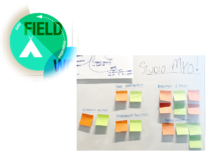
FIELD RESEARCH
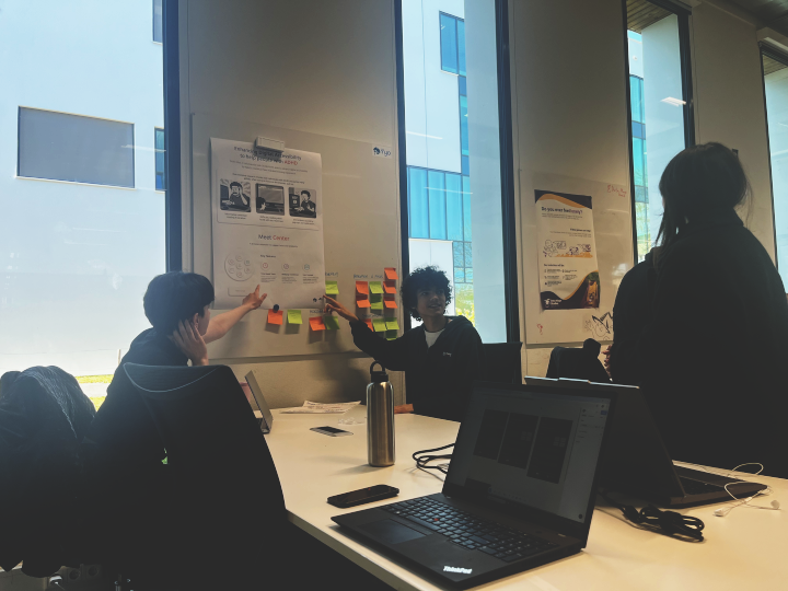
I made use of Field Research in the form of interviews with two individuals diagnosed with ADHD. I put together transcripts from which we could reference later. We put the collective information we gathered into an Affinity Map to better organize our findings.
CONCLUSION
We found based on our interviews that while there are similar patterns between individuals with ADHD, their preferences vary greatly, and so allowing for flexibility and customization is very necessary.
As for the research questions, we were able to come to the following answers:
-
Sub Question 1: What pitfalls do individuals with ADHD face when performing tasks and why do they experience them?
- Information overload, can be overwhelming
- Notification disturbance, some participants disabled notifications altogether
- Breaks interrupt hyperfocus, difficulty returning to work after break
-
Sub Question 2: How can our digital interface be designed and optimized to help mitigate these pitfalls?
- On-demand information instead of presenting it all at once
- Customization
- Minimal notifications
- Clean, uncluttered layouts
-
Sub Question 3: How effective are digital tools (e.g. focus apps, timers, task managers, sounds) in helping individuals with ADHD manage their tasks?
- Use of tools vary from person to person
- Simple tools preferred
-
Sub Question 4: What are the barriers individuals with ADHD face when adopting these tools?
- Stigma and social concerns
- Complex and overwhelming tools
- Multiple device clutter, inconsistency and distractions
From these answers, we gathered valuable insight into what to keep in mind when making our browser extension. This research helped us greatly in understanding the pitfalls these individuals face and how we can help.
POSTER
INITIAL DESIGN
We were tasked with making a poster for a concept showcase. My team began trying out various design and layout ideas in Figma, but I found that they didn't properly showcase the product itself! So I made my own poster with a mockup design of the extension, with the goal of showcasing the product itself.
I made heavy use of neumorphism, as it not only looked clean, but also resembled physical buttons. This was done deliberately to address some users' preferences for tactile feedback, making it feel like they were using a physical remote.
FEEDBACK
My teammates thought the poster looked great, especially the mockup which looked polished and helped us choose a direction to go in aesthetically. Although it looked good however, they found that the poster itself was too simple and needed more information about the extension.

FIRST ITERATION
I added extra information about the actual features included in the extension, which shows how we fix the pitfalls we're addressing.
FEEDBACK
My teammates found the addition of features to be helpful, but the poster was missing the user stories we're trying to address.

FINAL ITERATIONS
The initial designs my teammates did were a lot more focused on the user stories, and so we worked together to combine both approaches. The initial version we made shows the tool circle peeking from the bottom. I found that while it looked cool, it made the layout a bit messy.
I updated it to give more room to the features, which we all thought looked better and was chosen as the final design.
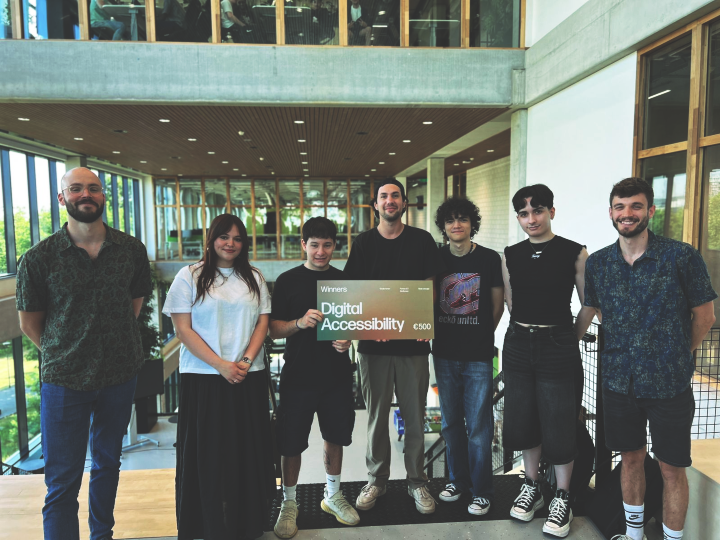
SHOWCASE FEEDBACK
Our teacher Jan found the idea cool, but warned us to not lose direction with so many tools. He said testing would be very necessary to ensure things are usable and helpful. The poster itself was well received by teachers we showed, with them praising its structure and effectiveness in communicating the idea.
Some students came over and also really liked the concept. One of them told us to make sure the extension doesn't just stay on the screen and instead works as a pop-up, as it would otherwise be distracting. We already planned to make it a pop-up, but this insight was still valuable.
Another student commented about the poster itself, saying it looked great and communicated the concept well, but could use more color.
REFLECTION
Collaborating with my teammates on this poster was very fun. My teammate Mila pointed out however that I have a tendency to remain quiet when the group works on something, then show something good at the last second.
In this case it was with the poster and mockup, which would've been more useful had I shown them earlier, and would've spared extra work from the group.
I think this behavior stems from not wanting to impose my ideas on the group in fear that I'll come off too controlling, but I realize now that it can be counterproductive and that I should try to communicate my ideas more often.
PROTOTYPE
Moving into the Figma prototyping stage, we decided to skip making a low-fidelity prototype and go straight into the high-fidelity one. This was done because we felt the design and layout were both dependent on each other and needed to be worked on at the same time.
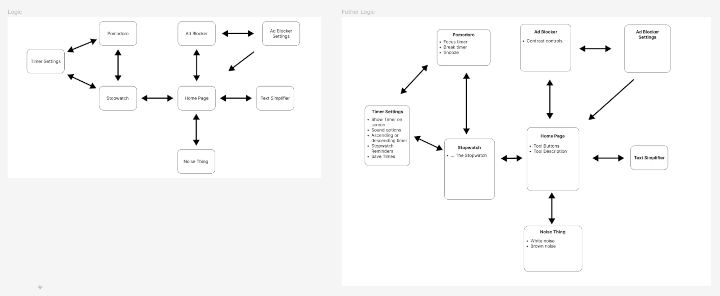
We did make a diagram showing the different pages we needed to make and how they would connect to each other. After laying this out, we decided to split the team into different groups to work on designs for different features. Mila and I were tasked with doing the Pomodoro and Stopwatch timers.
INITIAL DESIGN
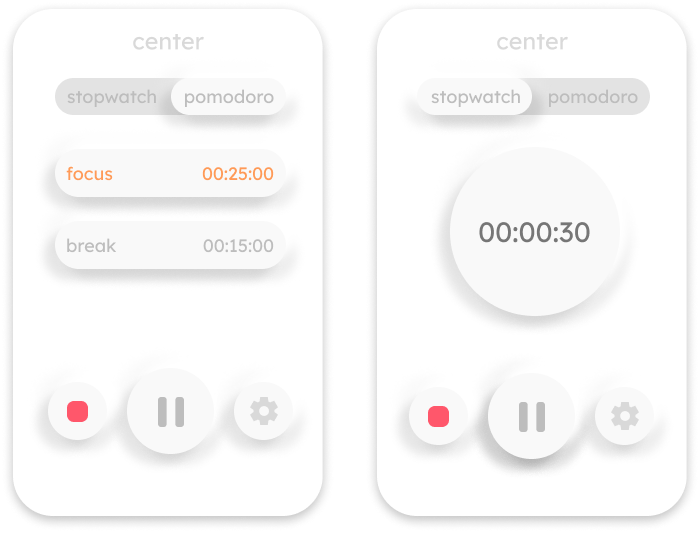
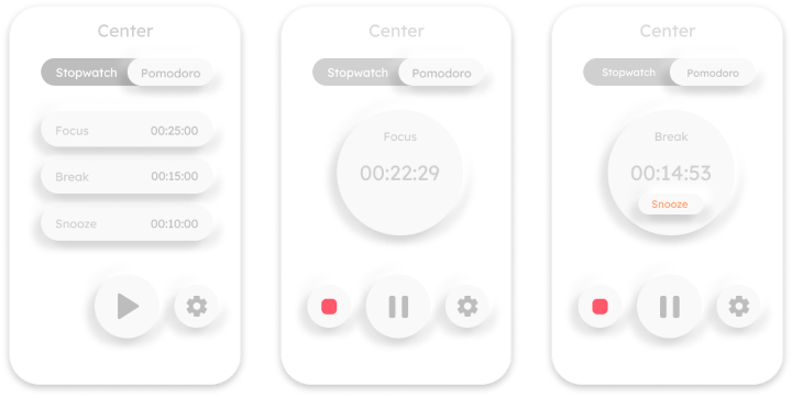
As the Pomodoro and Stopwatch timers fell under the same tool, I had to make a design where the user could switch between the two modes. In keeping with the tactile neumorphic design, I made a slider bar to switch modes.
The Pomodoro timer view showed the two modes, with the current one highlighted in orange. The Stopwatch used a more traditional timer design within a circle.
FEEDBACK
My teammate Yassine said the unselected button on the slider was a little hard to read, and suggested dropping neumorphism for the slider altogether in favor of a flat design.
Mila suggested we stop using full lowercase on text, as having the first letter be uppercase could make the text easier to read and identify.
FIRST ITERATION
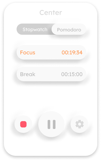
I changed the text on the unselected button to white, as well as removing the lowercase, making text overall easier to read.
I chose to ignore the suggestion to drop the neumorphism on the slider however, as I felt switching to flat design would make things inconsistent. I did agree that there was something that needed to be done about the bar, but this worked for now.
FEEDBACK
Mila suggested making the current Pomodoro timer view into a setup page, having it switch to a circle similar to that of the Stopwatch when started.
SECOND ITERATION
I made a circle view for the Pomodoro timer which shows the current mode. I also thought of a Snooze button with a custom time. I often find myself in a flow state when working that I don't want to interrupt with a break, and so I thought this feature could be useful to give the user a set amount of time to "snooze" the break timer and continue working.
TESTING
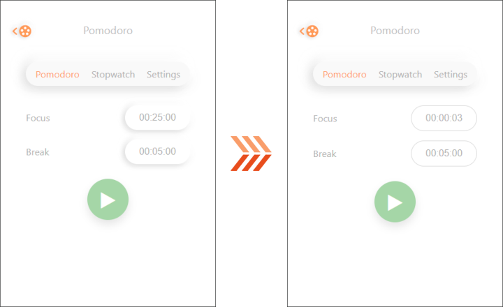
I tested the current prototype with my friend Stephan, whom I previously interviewed. Although the test went well, he couldn't tell at first that he could change the times for the Pomodoro. He asked if he could do it and I had to show him where to click.
FINAL ITERATION
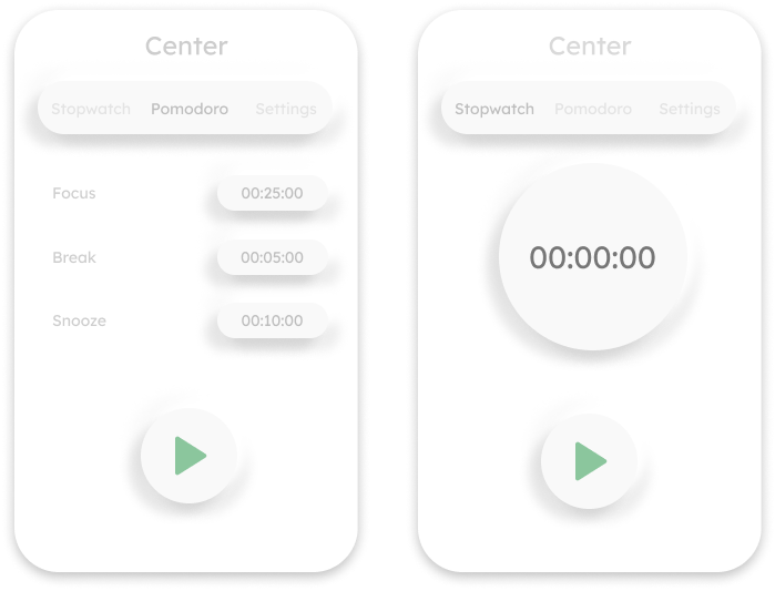
Based on the testing I did with Stephan, I modified the configuration screen boxes to only contain the times. This was done to see if the user would see it as more "clickable". I also moved the Settings to a redesigned top bar, doing away with the slider.
SHOWCASE FEEDBACK
The prototype was very well received, though we received some suggestions:
- Consider renaming "Snooze", as the name doesn't completely fit the button's purpose.
- Consider removing "Snooze" altogether as it goes against the whole idea of an interval timer.
The users also easily knew where to change the time on the timer and didn't question it, which we saw as a validation of this iteration.
Lastly, some students liked that the extension could be used by anyone and that they would use it themselves.
GIT REPOSITORY
We made use of a Git Repository to keep track of changes. As we were split in different groups, we made use of branches to keep our changes separate.

DEVELOPMENT
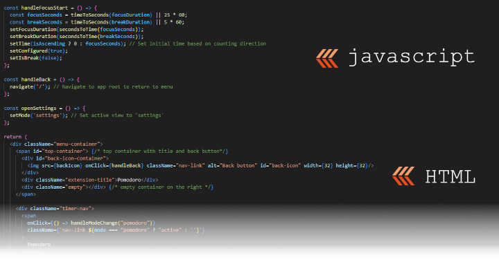
When it came time to start development, we chose to develop the extension using React, as we wanted to try a JavaScript Library and found the components feature interesting to try.
We split the team into the same groups as the prototyping stage, so I was tasked with working on the Pomodoro/Stopwatch timers with Mila.

PROCESS
Working with two people on one feature is quite hard, but Mila and I made a system where she would use AI to generate a base code that she would make changes to. I would then take this code and figure out the necessary syntax and functions needed to link it to the rest of the project, as well as finalizing styling.
Styling in particular really helped me get more acquainted with the code, as I started figuring out how the elements actually worked. I took a liking to React/JSX's method of mixing JavaScript with HTML, doing the script logic first, then rendering the HTML later, all within the same file.
THE "SNOOZE" SOLUTION
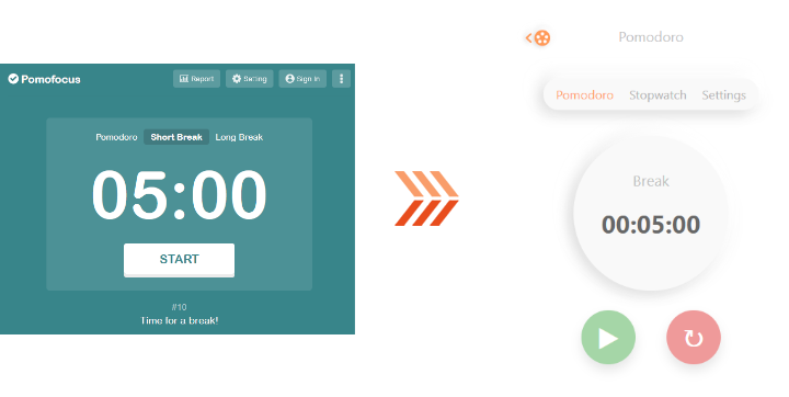
Based on feedback we received about the "Snooze" button, we decided to scrap it entirely. During the last few weeks of development however, I got curious and started making use of a pomodoro timer myself with the site Pomofocus.
I realized that the break doesn't actually start immediately, instead it's left up to the user. I made sure to replicate this behavior with our timer, giving the user the chance to start their break when they are ready.
SOUND
Due to the possible sensory issues or sensitivity that come with ADHD or neurodivergency in general, I made the alarm sound from scratch.
I avoided using higher frequencies, instead focusing on bass frequencies to mimic haptic vibrations. This helps the alarm be noticable but less intrusive and disturbing.
FINAL TESTING AND ITERATION
I tested a close to final version of the timer with a user with autism and she figured things out very easily. She thought it was very well made and very well thought out.
Yassine also did a test and noted that the user he tested still didn't realize they could change the time immediately, and so we made the last-minute design decision to change the input style into a thin outline instead of a box.
This helped distinguish the input from a regular button, while still telling the user it was clickable.
FINAL SHOWCASE FEEDBACK
Project Center was very well received, with people expressing interest in other browser options and more customization. One of our teacher's really liked the counting direction feature, and agreed with our reasoning for it. There was a bug with the timer I didn't catch, which was the alarm sound didn't play when the extension was out of focus.
This was forgiven by the teacher that noticed it, as it's easy to overlook but a good thing to learn from.
REFLECTION
Really enjoyed working on this project. Great team and great communication all around. The guys at Studio Krom were very enthusiastic and a pleasure to work with.
I learned a lot from this project, especially when it came to my perfectionism about things. Upon finding out about the alarm sound bug, I went scrambling to try and fix it in time for the presentation. I was unable to do so, and so my performance while presenting suffered.
I handled it quite well though, better than I would've in the past. So I can confidently say I've grown a learned a lot with this project.