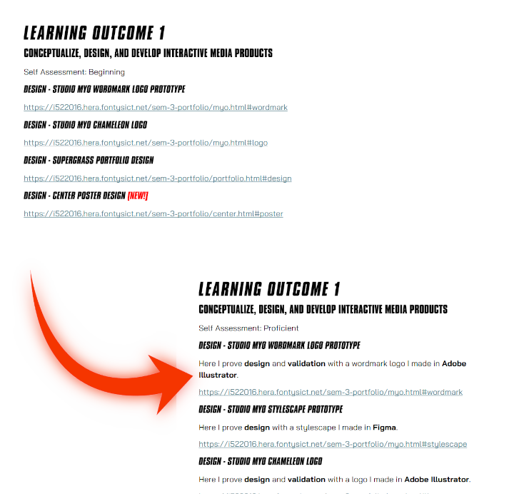
SUPERGRASS PORTFOLIO
Portfolio based on Supergrass' 1999 self titled album.
CONTEXT
INSPIRATION
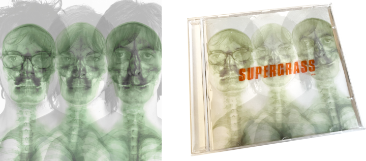
In late 2024 I got really into the band Supergrass, having their first three records in heavy rotation since. I was fascinated by the album cover of their self-titled third album. It depicts the three members superimposed over x-ray images of their skeletons. The CD jewelcase also has a sticker with the band's wordmark logo in a transparent red.
The cover reads to me as the band showing their true selves both whole and at a skeletal level, reflected in the music with their free experimentation alongside their strong acknowledgement of their influences. Titling the album "Supergrass" reads to me as a deliberate statement of "This is who we are".
And so I chose to base my portfolio around this album cover, as not only would it be fun to recreate as a website, but also it represents my authentic self through my creative experimentation and acknowledgement of my influences.
DESIGN
SKELETON
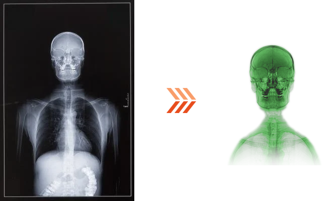
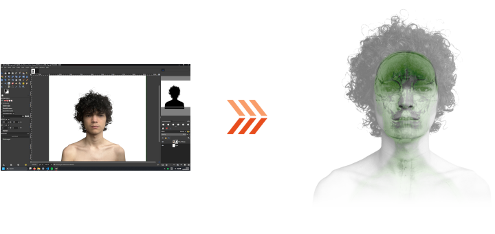
My idea was to recreate the album cover with me being the subject. In order to do so, I had to recreate some assets from scratch, starting with the skeleton x-ray. I took an image of an x-ray and messed with its colors and transparency to get it looking as close to the original as possible.
FONT
I made sure to find the same font used on the album artwork, which is called Compacta. I used it for headings and used Bai Jamjuree for regular text, as it worked well in my last portfolio.
PORTRAIT
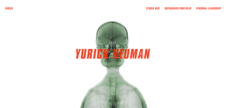
I also had to get a portrait of myself, but before getting around to it I chose to put the skeleton alone in earlier iterations of the portfolio. I thought of it as symbolic of the portfolio's skeletal state.
When I finally got around to getting the picture, I used a mask to remove the background and composited it with the skeleton, playing with the opacity levels until it resembeled the album cover.
LAYOUT
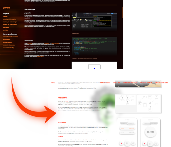
I based my content structure on my previous portfolio, recoding it from scratch but keeping the same
"text on the left, images on the right" layout. My teachers had a good time navigating it before, and so I just decided to replicate it.
FEEDBACK
Overall my teachers and peers loved the portfolio design and its layout, with any suggestions only being made on the actual presentation of the content. For example, some images were not very clear, especially in context with the text. These issues were later addressed and validated.
GIT REPOSITORY
I made use of a Git Repository to keep track of changes, along with a README with links to the portfolio and its reading guide.
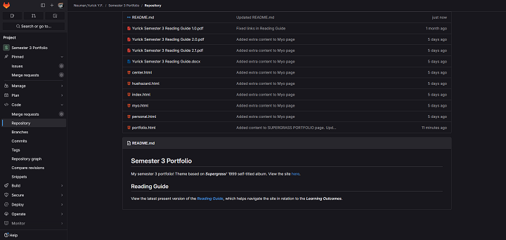
IMAGE HOVER EFFECT
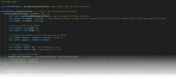
I used JavaScript and CSS transform functions to make a cool image hover effect, with code comments to explain the process. I had help from ChatGPT trying to put it together and understand what every function did.
READING GUIDE
I created a reading guide PDF to help navigate this portfolio and its learning outcome proofs.
FEEDBACK AND ITERATION
One of my teachers noted that my initial reading guide was lacking in proper descriptions for the proofs. This was corrected and validated later on, and my teachers were able to easily navigate the guide.